ending the year with style
As it gets colder outside and Christmas and New Year are getting closer, it is an excellent time to work on side projects. One of the things I have always wanted to do, but I have always been busy and never got around to, is to re-style my website based on the awesome Jekyll Klisé theme by piharpi. I love the minimalistic design; it is just super clean! Over time, I have introduced a book section and adjusted things here and there. However, besides some minor changes, like adding a new “What I’m up to now?” section (inspired by Derek Sivers) on the front page, the theme has stayed the same!
Searching for the right font
Meet Gilroy!
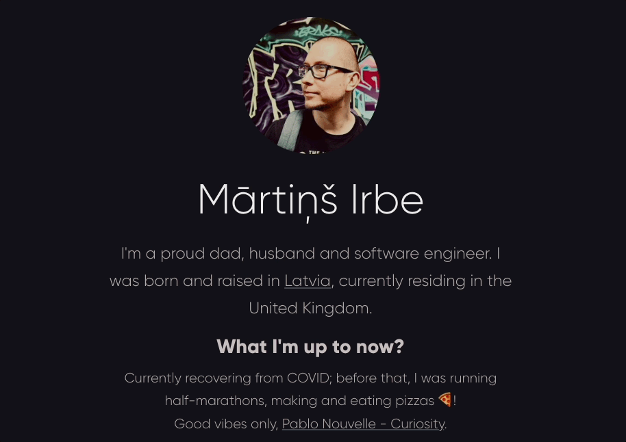
The first thing I decided to change was to use a fancy-looking font. Choosing the right font for my website has been one of the most complex decisions I have made. I have tried a few free and paid fonts over the past six months, but nothing stood out. Then, by chance, I stumbled across Radomir Tinkov’s fonts, specifically Gilroy! On his website, Radomir provides two fonts for free for personal use. This font is elegant and fits the theme very well!
Choosing the suitable sizes
To make the theme more responsive, I replaced absolute pixel units (px) with relative root-em units (rem) to ensure that fonts scale with the viewport. Using rem units means that the font size depends on the following:
- The HTML root element.
- The font size configured in the web browser, which is typically
16 pxby default.
After that, I applied the 62.5% font size trick font size trick; it’s worth reading if you are interested in making it easier to work with rem units. In layman’s terms, this converts rem to be multiples of ten in px; think of 1 rem as equal to 10 px when setting the html element font size to 62.5%.
Profile changes
Looking at the profile section, I have three designated sections:
- Profile Photo
- Short Bio
- What I’m Up To Now
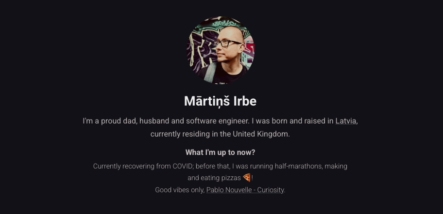
After updating the font and the font size, it was already a significant improvement. Sections now stand out more and are easily readable when opening the website.
Navigation bar changes
The menu bar seemed quite minimalistic, but there were still a few things that I decided to change.

I have removed the RSS button to make the navigation bar even cleaner. However, if you are interested, you can still fetch the RSS feed. I changed the link styling to add some transition effects and removed the pink link border.

Dark & Light theme toggle
I have updated the dark/light theme toggle to use Steve Schoger’s icons and to change the icon when toggling between themes from the moon to the sun and vice versa.
While I mainly work on designing and developing backend systems, it was fantastic to spend time changing things up while learning a few things about UI/UX. The new look definitely hits the mark for ending the year with style in my books!